Recently, I chanced upon an article written by Suzanne Greene, which was published in the MIT Climate portal. The article was brief and very informative. Reading that article sort of sent me down the proverbial rabbit hole where I read many articles on freight transportation and GHG emissions. I must admit there were a lot of information to digest. SO I decided to do a basic research on the topic.
In my view, it certainly looks easier for governments to implement policies to curb GHG emissions from passenger transportation than from freight transportation. For example, governments can implement policies to persuade people take public transit or take up active transport, but developing policies for freight transport is difficult. For freight transport relies heavily on fossil fuels and is needed to transport large amount of raw materials, finished products and so on. Furthermore, electrification, which is another potential solution to reduce GHG emissions, is relatively easier to adopt for smaller vehicles and for shorter travel distances than for the freight transport.
To learn more, I guess the starting point would be to see what the CO2 emissions have bee for different states over the last few years. The carbon emissions includes all sectors not just transportation. The data can be downloaded from here.
#Downloaded and saved the data locally
co2.emission <- fread('co2bystate.csv')
co2.emission <- co2.emission[State != 'United States'] #Row that contains the total emissions

#Used the melt function here to facilitate the plotting
co2.melt <- melt(co2.emission, c("State"), measure = patterns("20"))

ggplot(co2.melt, aes(x = value, y = State, fill = State)) +
  geom_density_ridges() + theme_ridges(font_size = 6,
  grid = FALSE,
  center_axis_labels = TRUE)+ theme(legend.position = "none")
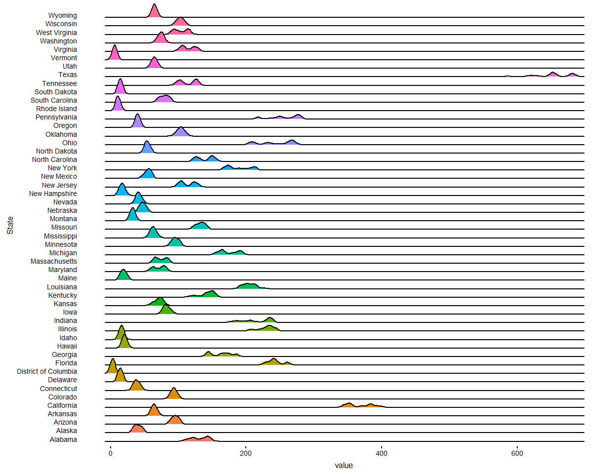
The above figure shows that there are a few states that are leading others in CO2 emissions, notably, Texas, California, Illinois, Florida, Indiana. The rest of the post will focus on the flow of commodities from Illinois to other US mainland states, particularly domestic flows (no imports and exports). I used the data published by Bureau of Transportation Statistics (BTS). The data include estimates in weight and value. I am using the estimates (weights in thousand tons) for the year 2025. For more details on the data, please refer this pdf. Moreover, the visualization of flow of commodities is in part inspired by this blog.
So, let’s get started.
I downloaded the data from the BTS website, and unziped and stored it in my local computer. The file is quite large, around 800 MB. From my experience, the R package data.table works really well in handling big data. I used a sample of the data to show you some calculation.
Since, we are only concerned about the domestic transport, the trade_type is 1. Other information needed for the visualization are: 1. Name of the origin state 2. Name of the destination state
The problem is that dms_fips column values refers to the specific regions within states. Therefore, we need all the digits except the last one. For example, 131 is the value, which in its entirety corresponds to the following regions in Georgia: Atlanta, Athens, Clarke County and Sandy Springs. The first two digits i.e. 13 corresponds to the state. So, we need to extract that from the column.
Now, it is time to plot some maps. So, we first need to download US states map. You can go on to the US Census Bureau website and download it. I downloaded one and stored it locally. To plot the commodities flow, we need the US mainland states map. We will only consider trade_type == 1 and orig_state == Illinois.
data_2 <- data_2[trade_type == 1 & orig_state == 'Illinois']
state_ <- st_read("shapefiles/cb_2018_us_state_500k.shp")

#Changing the projection to Albers
state_albers <- sf::st_transform(state_, 5070)
#Calculate the Centroids, which we will use later
state_albers <- state_albers %>% mutate(lon = map_dbl(geometry, ~st_centroid(.x)[[1]]),
                            lat = map_dbl(geometry, ~st_centroid(.x)[[2]]))
#Selecting the mainland states
state_origin <- unique(data_2, by = "dest_state")[, dest_state]
state_origin_ <- setdiff(state_origin, c('Hawaii', 'Alaska'))

state_new <- state_albers[(state_$NAME) %in% state_origin_,]
Now, we have the shapefile with all information we need, we will need to extract the inforamtion from the freight estimates. sctg2 is the column that contains the commodities type, and as mentioned earlier, trade_type is 1 for the domestic trips.
#all domestic trips from Illinois to other states
illinois_ <- data_2 %>%
  group_by(orig_state, dest_state) %>%
  summarise(avg_freight = mean(tons_2025),trips = n(), region = as.factor(mean(dest_region)))

#Data for drawing the edges

edges_ <- illinois_ %>%
  inner_join(st_drop_geometry(state_new) %>% select(NAME, lon, lat), by = c('orig_state' = 'NAME')) %>%
  rename(x.orig = lon, y.orig = lat) %>%
  inner_join(st_drop_geometry(state_new) %>% select(NAME, lon, lat) , by = c('dest_state' = 'NAME')) %>%
  rename(x.dest = lon, y.dest = lat) %>% filter(!dest_state %in% c('Hawaii', 'Alaska'))

#Deleting teh Illinois to Illinois trips

edges_1 <- filter(edges_, orig_state == "Illinois" & !dest_state %in% c('Hawaii', 'Alaska', "Illinois"))
We have all the data to plot the commodities flow from Illinois to other states. Let’s plot the map.
maptheme <- theme(panel.grid = element_blank()) +
  theme(axis.text = element_blank()) +
  theme(axis.ticks = element_blank()) +
  theme(axis.title = element_blank()) +
  theme(legend.position = "bottom") +
  theme(panel.grid = element_blank()) +
  theme(panel.background = element_rect(fill = "#536243")) +
  theme(plot.margin = unit(c(0, 0, 0.5, 0), 'cm'))

ggplot(data = state_new) + geom_sf() + geom_point(aes(x = lon, y = lat)) +
  geom_curve(data = edges_1, aes(x = x.orig, y = y.orig, xend = x.dest, yend = y.dest,
                                 color  =  region,  size = trips), inherit.aes = FALSE, curvature = 0.33,
             alpha = 0.5) +
  scale_size_continuous(guide = "none", range = c(0.25, 2)) +
  ggrepel::geom_text_repel(data= edges_1,aes(x=x.dest, y=y.dest, label=dest_state),
                           color = "darkblue", fontface = "bold", size = 2, max.overlaps = 20) +
  guides(colour = guide_legend(override.aes = list(alpha = 1))) + maptheme

We can further narrow down and see specific commodities flow. The type of commodities are denoted by the sctg2 column. For example, code 1 means Animals and Fish. We will select only Animals and Fish and see the flow now. We can simply add an extra condition sctg2 == 1 to data_2 just before group_by command.

It looks like the amount of animals and fish transported to Iowa, Michigan, Indiana, Wisconsin is larger than other neighboring states.